
Alliance of
Pioneer Square
Redesign and branding the website based on visual communication.
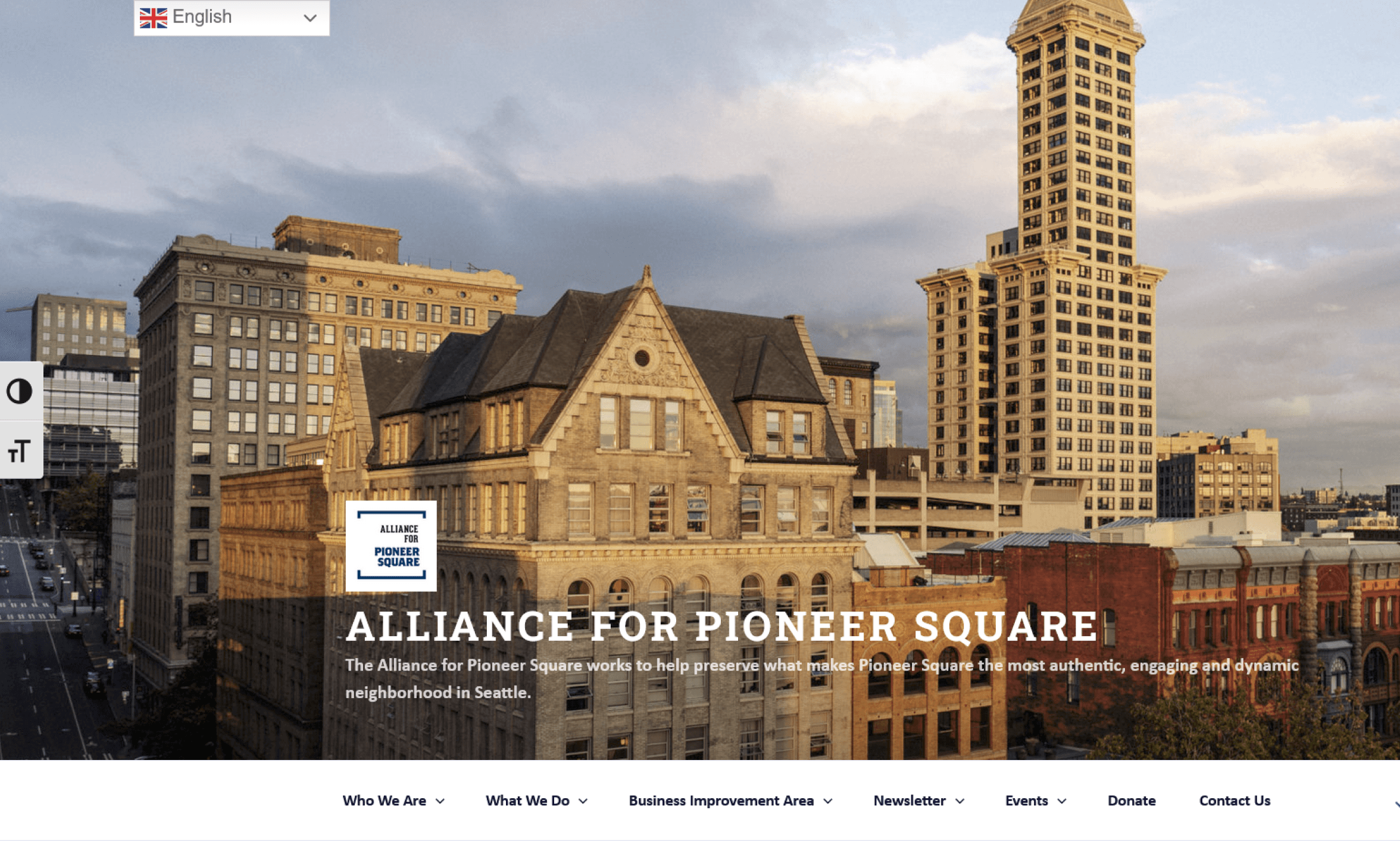
Alliance for Pioneer Square
Events
What We Do
Business Improvement Area
Who We Are
Newsletter
What we do
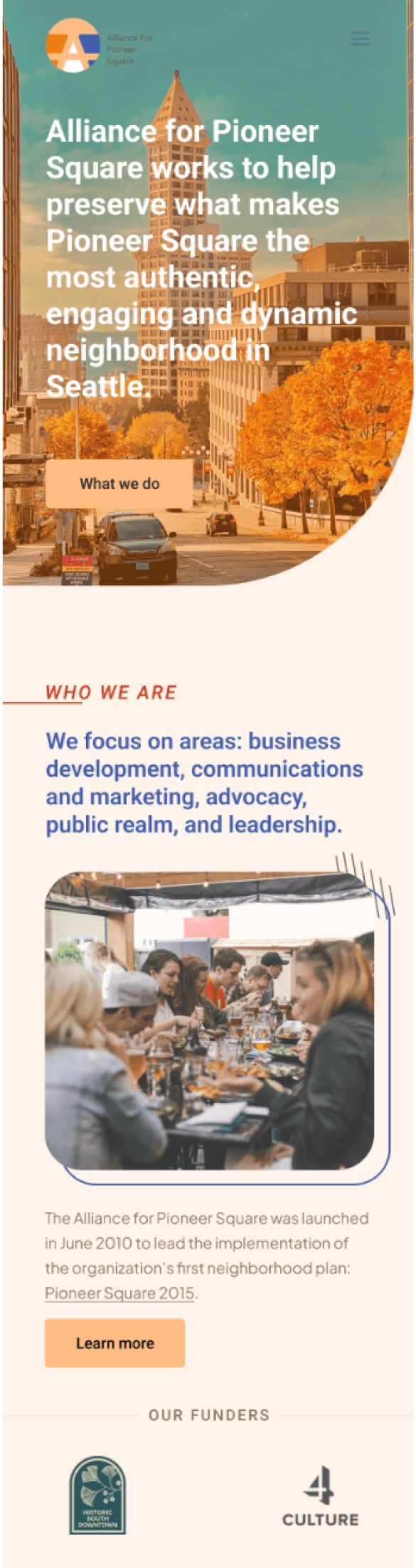
Alliance for Pioneer Square works to help preserve what makes Pioneer Square the most authentic, engaging and dynamic neighborhood in Seattle.
Overview
MY ROLE
Visual Design
UI/UX Design
UX Research
Branding
(Solo Project)
Tools
Figma
Vegas
Duration
3 months
(Mar - Jun 2023)
Project Type
Website redesign
About Client
The Alliance of Pioneer Square is a nonprofit organization that focuses on Seattle's Pioneer Square district and the well-being and activities of the local community and stakeholders by helping Pioneer Square gain greater visibility through a series of planning and outreach activities.
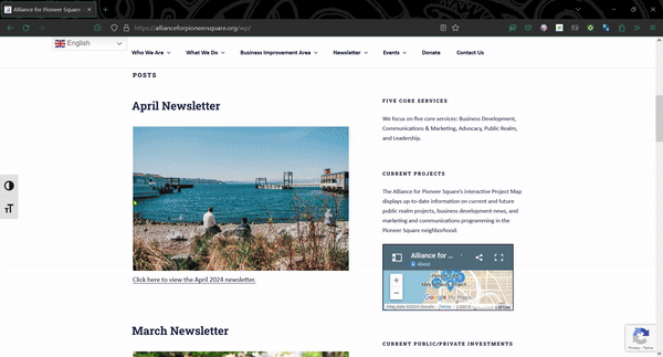
Problem
The current website design lacks modernity and fails to effectively showcase the dynamic essence of Pioneer Square, hindering its ability to attract visitors to events and local information.
Communication Goals
Usability, Differentiation, Visual Appeal.
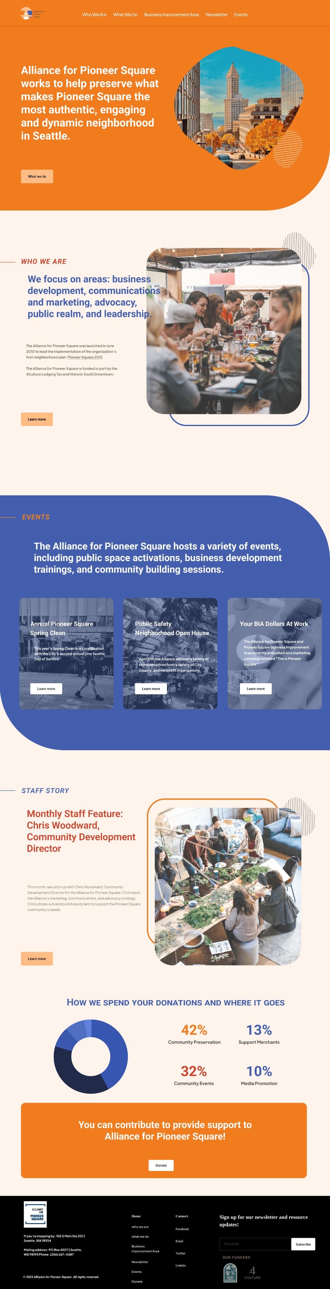
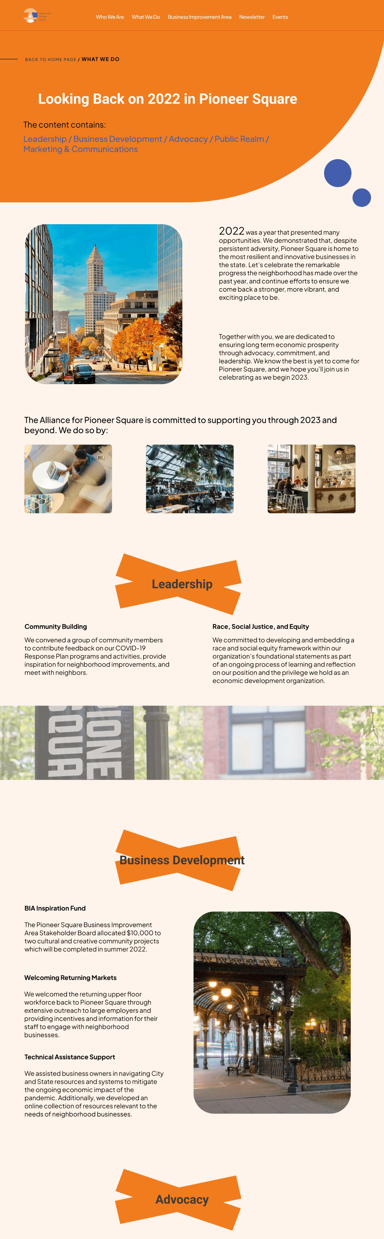
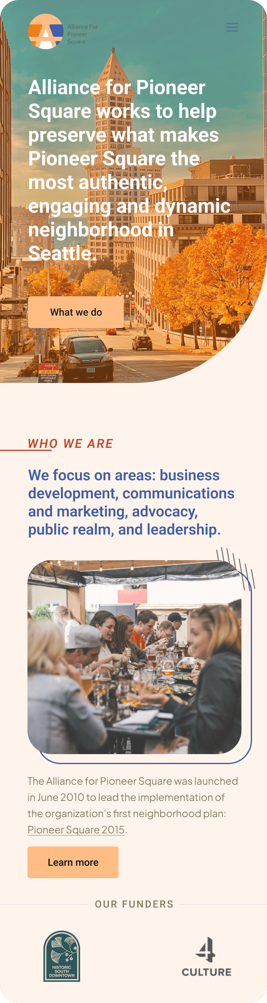
Final Design Overview

Research
01 Current Website UX Evaluate
Research Questions
What is the current state of the website's readability, accessibility, and competitive positioning, and how can improvements in these areas enhance user engagement and reflect the vibrancy of Pioneer Square?
1.1 Analyze Content Readability
When changing the large font, it can't be displayed correctly and completely, and part of the hero heading is overwritten, the layout was broken.
Lack of attention to visual design can make the website appear. unprofessional or outdated. Also, the information in the homepage is not clear, and no distinction is made between the latest campaign content .
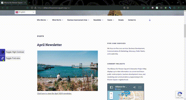
1.2 Accessibility Evaluation
The high contrast of font color makes the website difficult to read, especially for users with visual impairments.
The background is too dark but the font color is oversaturated.
1.3 Competitive Analysis
While there may be other organizations and businesses operating in the Pioneer Square neighborhood, the Alliance for Pioneer Square is unique in its focus on historic preservation and community development. However, they work in partnership with other organizations and stakeholders to promote the neighborhood's interests.
Some potential competitors may include other non-profit organizations, local businesses, and government agencies.
How might we enhance the user experience of the current website to better reflect the vibrancy of Pioneer Square and increase engagement with events and local information?
02 Design Goals
Based on research and understand of client, combined with their missions, a few directions for my design concerns are proposed. I wanted to be able to highlight these features in the design in relation to the client's needs and their positioning.

Design
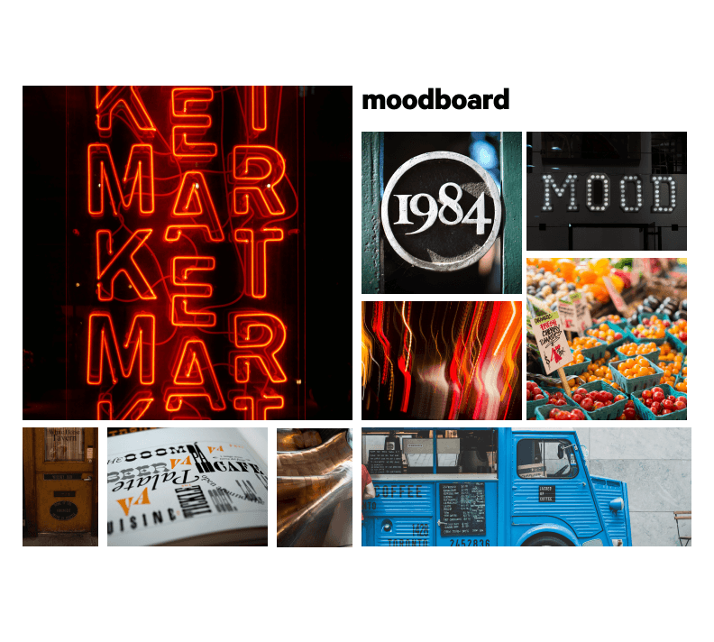
01 Mood Board
With moodboard, I kept the three words I wanted to show: modern, dynamic and exploratory. Since this is a historical district but at the same time wants to attract tourists through different activities to promote economic development and unite the residents and traders of the area, the fusion of history and modernity is very necessary, I added a lot of commercial elements in the mood version, such as food trucks and markets, as well as blue elements, which can reflect more calmness, hope and the values of ngo. The energetic elements are still shown through orange and red.
02 Grids and Wireframes

Website: 12 Row, 16 Columns
In the web and mobile design, I implemented a partitioning system based on ranks to ensure each section ends with an appropriate gutter.
Furthermore, I strategically utilized margins to enhance the presentation of information, ensuring it is effectively centered
on the page.
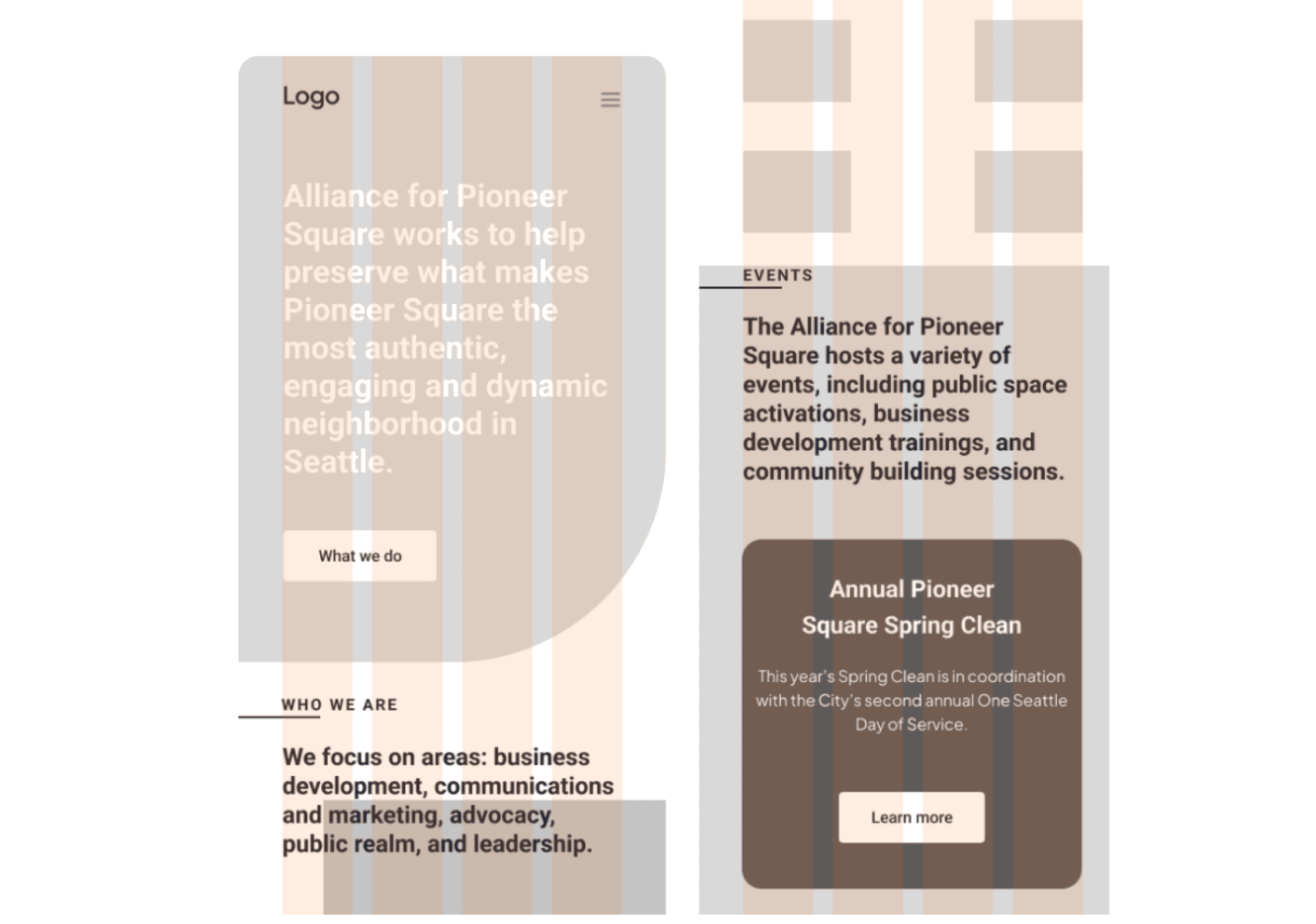
Moblie: 14 Row, 4 Columns
To enhance user comprehension, I aimed to present information in a concise and clear manner, accompanied by key sentences for quick understanding. I also ensured that there is an appropriate spacing between each section, avoiding overcrowding and making the content easily readable.
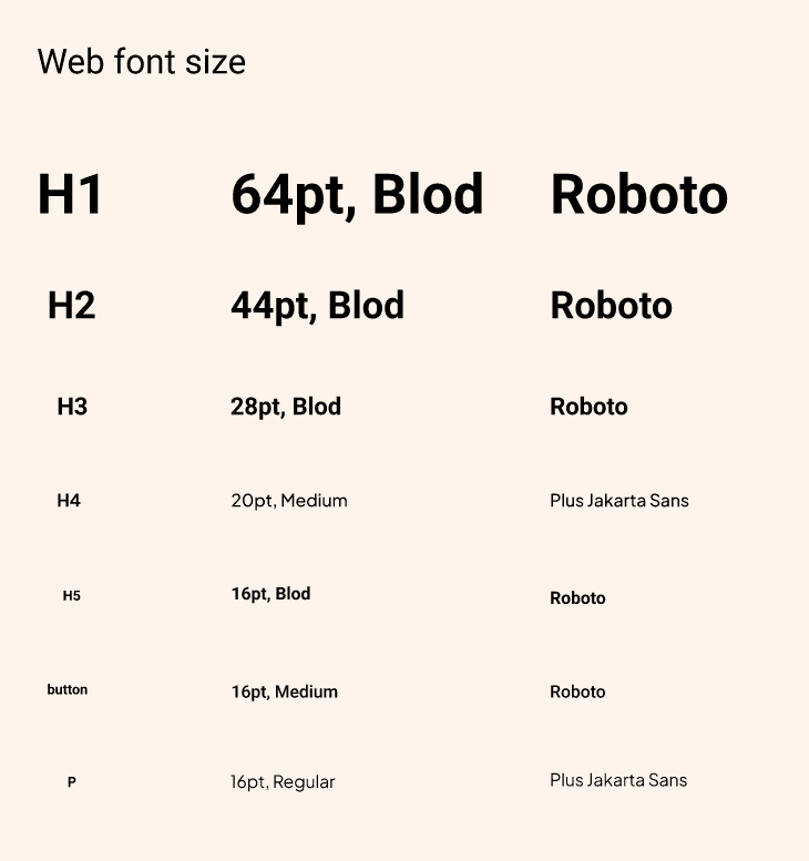
03 Typography
Roboto
Roboto has good readability, it is clear and easy to read in different sizes and media. It has an open counter with balanced proportions. The sans-serif typeface is more modern. The sans-serif typeface was more appropriate than the serif typeface based on clients' needs , and Roboto's lines are very clean and simple.
Plus Jakarta Sans
Plus Jakarta Sans is designed with excellent legibility in mind. Its clean and simple letterforms make it highly readable, ensuring that the content is easily comprehensible for users. The font carries a modern and contemporary aesthetic, making it suitable for a wide range of design styles.

04 Logo
In the logo design, I opted for lines to delineate
blocks and convey a sense of the neighborhood.
I made modifications by reducing the number of
lines and divisions. Additionally, I incorporated a
capital A shape to symbolize alliance, while the
forward-extending lines represent roads. These
changes enhance the logo's professional appeal.

05 Colors

Final Design
01 Website Design
02 Mobile Design
03 Media Design
Reflection
Takeaways

The group critique brought a lot of inspiration, and each person from a different angle could give me a whole new perspective on how to think about scheduling.
Perhaps more fun needs to be considered ...... Considering that the user is ngo I didn't make more challenges for typographic "play", maybe it's time to think about how to make the site more lively!

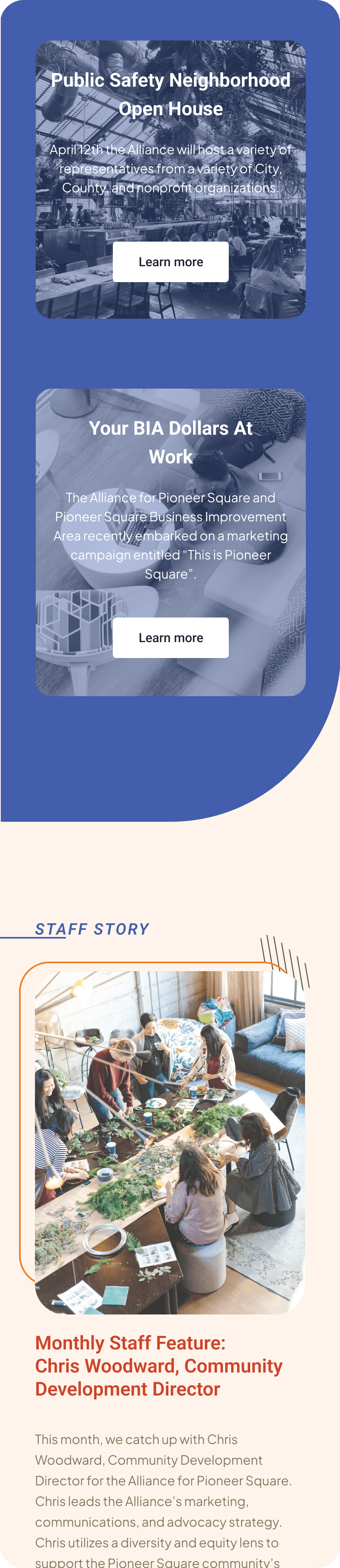
02 Mobile Design

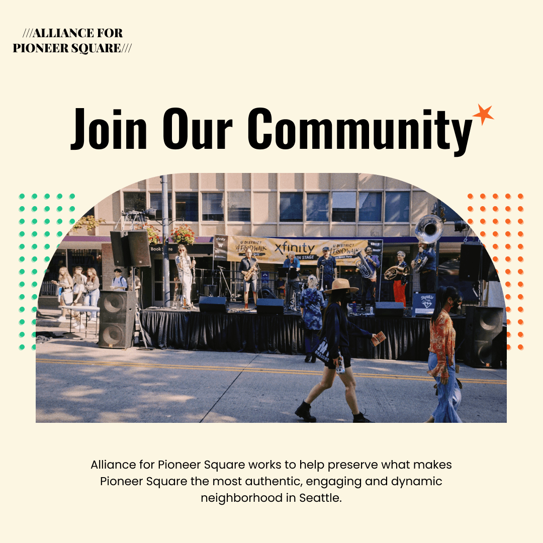
03 Media Design
Reflection
Takeaways

The group critique brought a lot of inspiration, and each person from a different angle could give me a whole new perspective on how to think about scheduling.
Perhaps more fun needs to be considered ...... Considering that the user is ngo I didn't make more challenges for typographic "play", maybe it's time to think about how to make the site more lively!