UX research | Interface Design
COMPANY
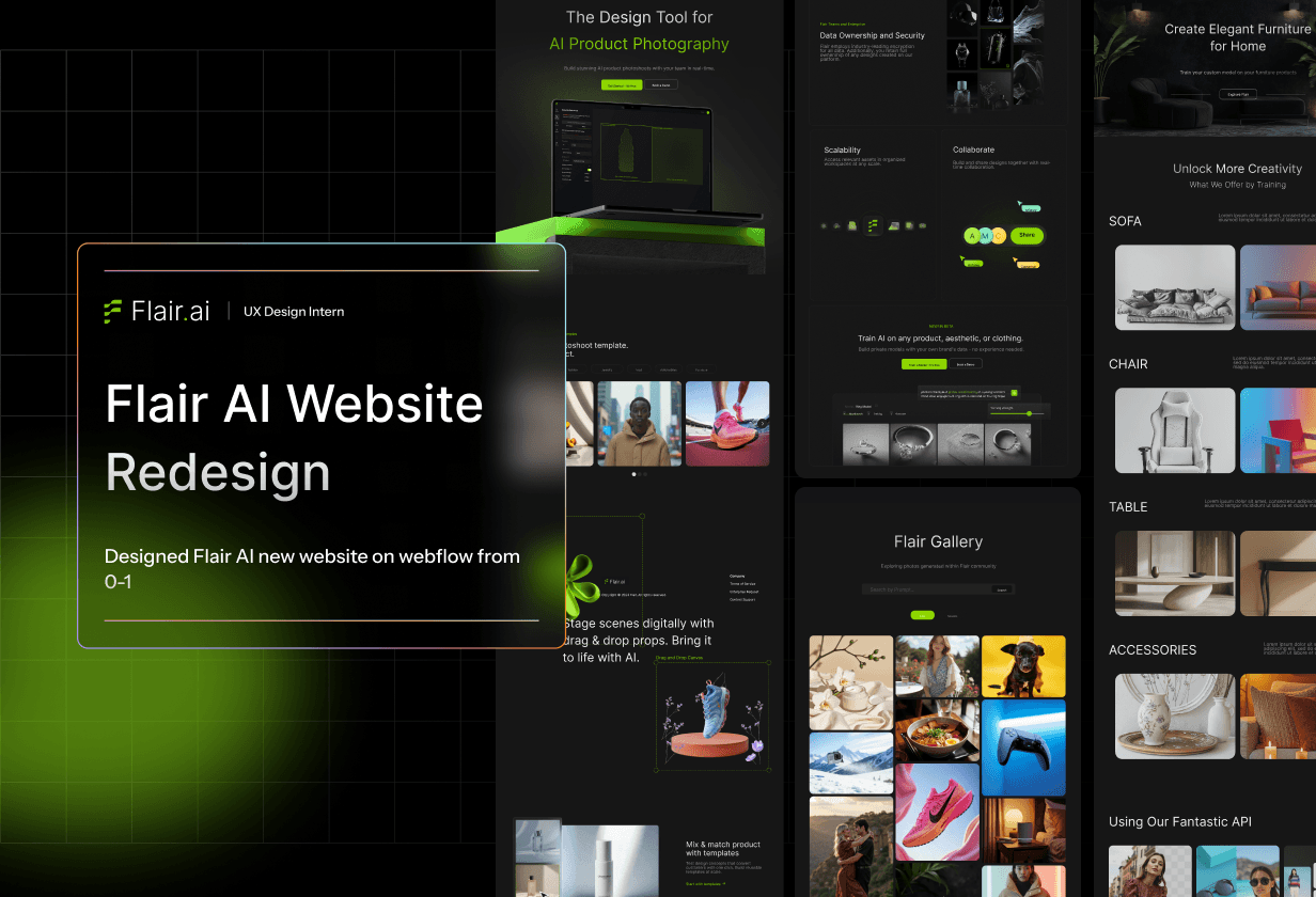
Flair AI
ROLE
UX/UI Designer Interaction Designer
Team
Personal Project
YEAR
Oct - Nov 2024 (2 months)
Project description
🛠️ My Role
As the sole UX Design Intern, I led the full redesign and migration of Flair’s website. I worked cross-functionally with the product and marketing teams to plan the content structure, rework the user flow, and design responsive, on-brand pages in Webflow.
🎯 Project Goals
Increase visitor engagement by making the site more informative and easier to navigate.
Improve conversion by guiding users toward key actions.
Establish design consistency across all pages, aligning with Flair's evolving brand identity.
Ensure scalability by migrating the site to Webflow, enabling easier updates by the team.
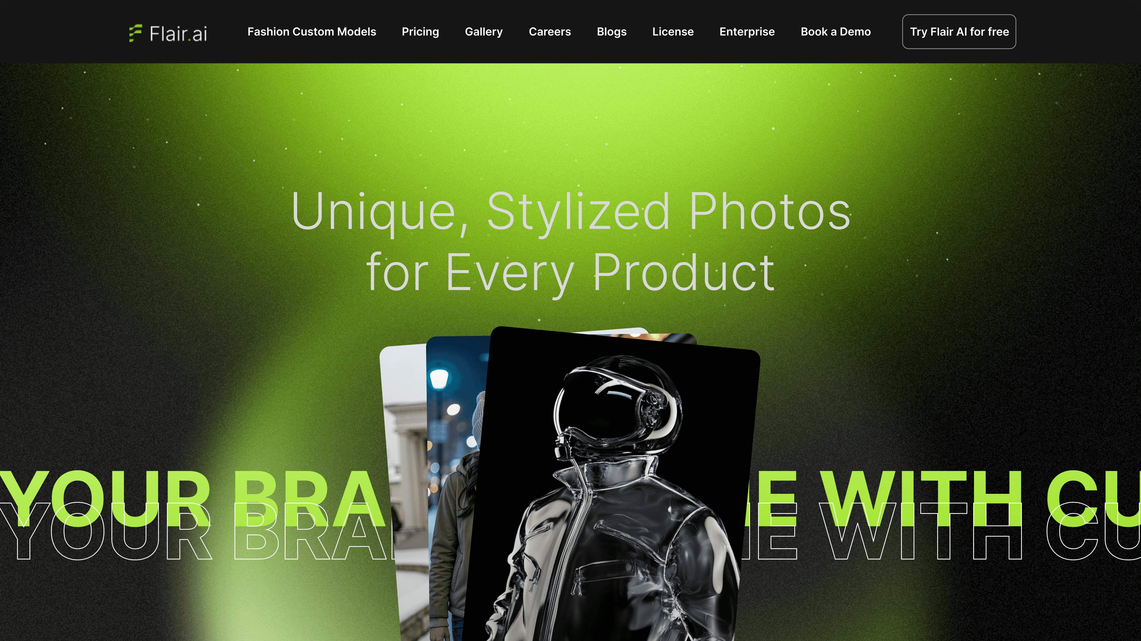
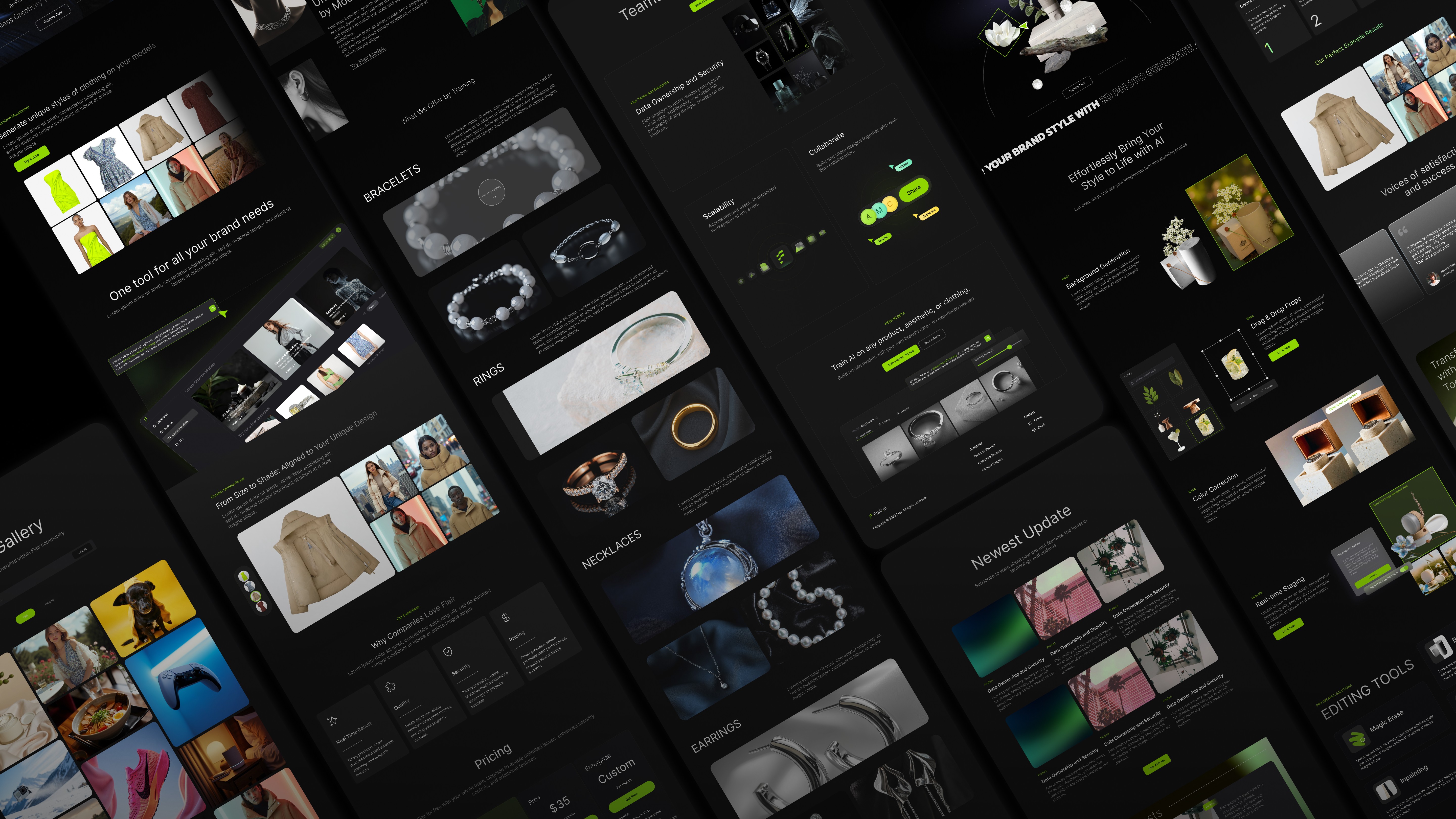
Final Design
To See the whole website design please click this link: Flair AI
Clearer Visual Hierarchy
Redesigned the layout to guide users’ attention — using bold headlines, clear sections, and intentional spacing to improve readability and focus on key actions.
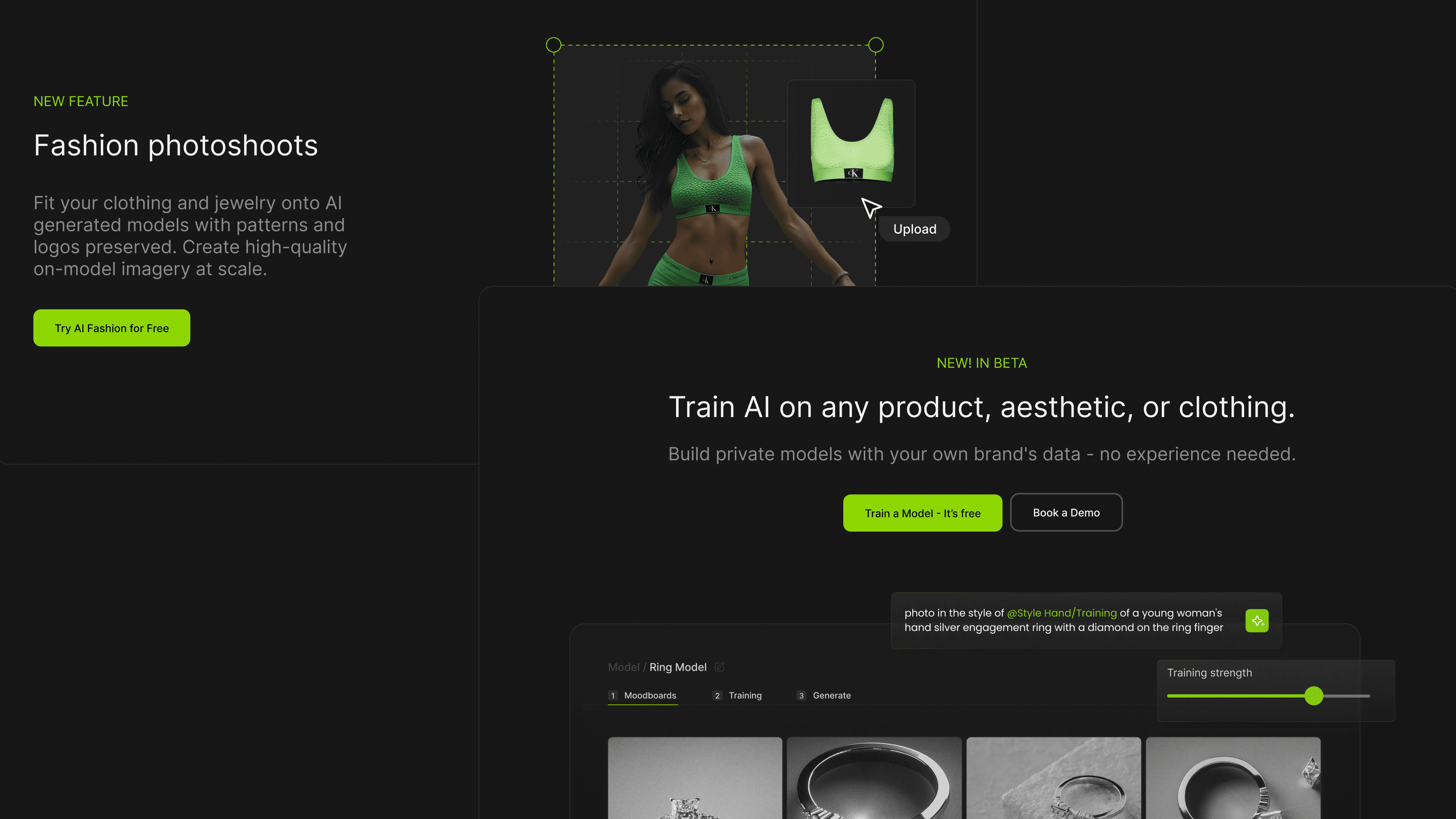
Stronger Product Storytelling
Reorganized content to tell a more cohesive product story across pages. Added sections that explain what Flair does, who it’s for, and why it matters — all in fewer words.
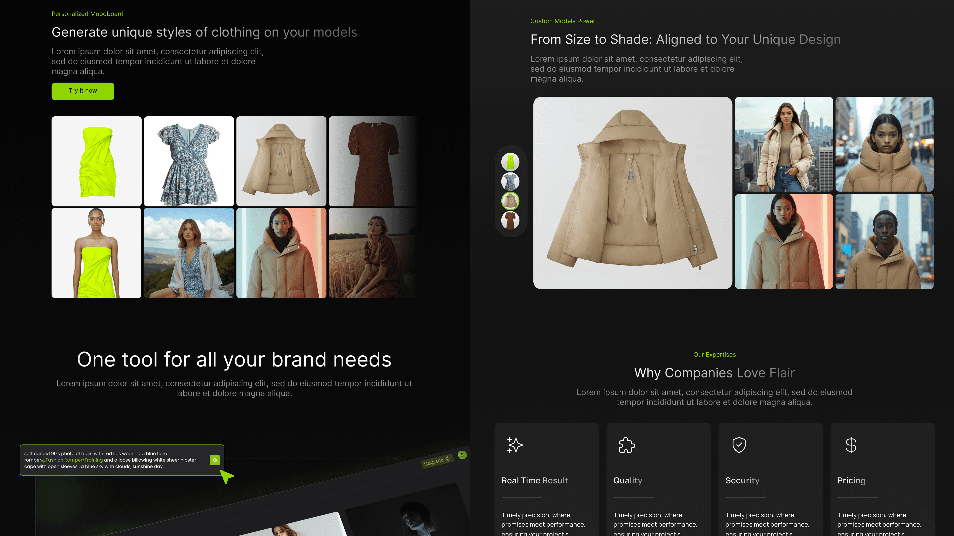
Conversion-Friendly CTA Placement
Placed calls to action strategically across pages — like "Try it now" and "Train your model" — to reduce friction and guide users toward the next step.
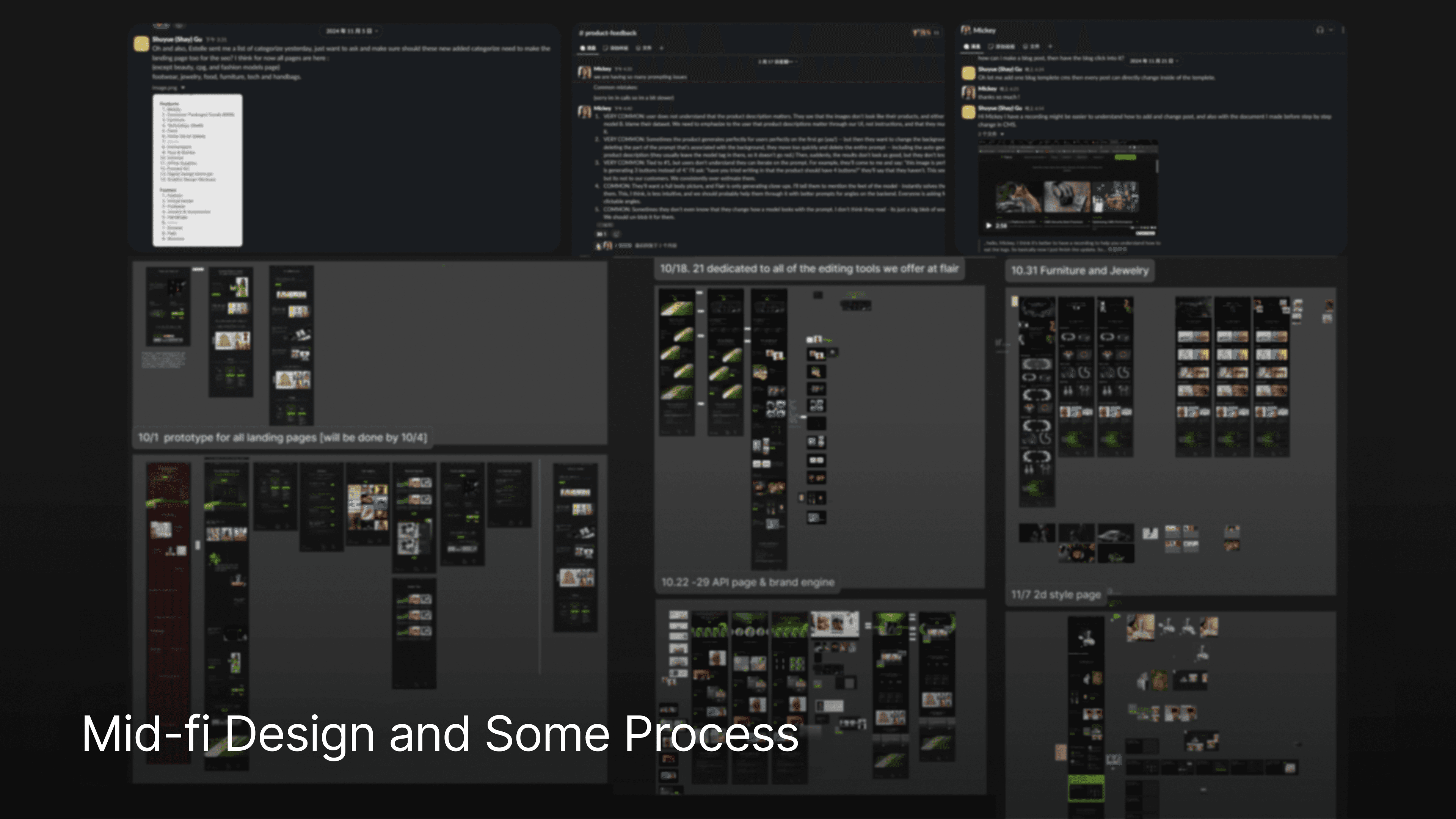
Process
To start with the design, I had a meeting with our CEO and ask the feedback from our users about their feeling of the website.
🧭Research & Planning
I met with stakeholders across the company to collect feedback on the original website. While we didn’t have formal user research, I gathered plenty of insights through internal conversations:
The site lacked structure and clear CTAs.
New users didn’t always understand what Flair could do.
Important product features were buried or not well explained.
🧱 Identifying the Core Needs
After aligning with the team, I summarized four key design goals:
Add a Gallery Page: So potential users could explore real results made with Flair, building trust through visual proof.
Create a Blog Section: To house product updates and tips for power users and SEO benefits.
Redesign the Homepage: Make it more visually engaging with clear call-to-actions that guide users to try the product faster.
Design Function-Focused Pages: Explain major product features in detail, boosting discoverability and helping users understand what each tool does.
✍️ Updating & Designing
From there, I split the work into two tracks:
Updating existing pages to improve layout, structure, and copy clarity (especially the homepage and pricing page).
Designing new pages from scratch, including the blog, gallery, and feature-focused pages. I sketched and built out wireframes, then polished them in high-fidelity to match Flair’s visual style.
Design System
To ensure the new pages felt cohesive and could scale easily as we added more content, I created a lightweight design system tailored for Webflow implementation.
I focused on:
Reusable Components: Buttons, cards, section layouts, and navigation patterns were built as flexible modules to ensure consistency across the homepage, blog, gallery, and feature pages.
Typography & Spacing Rules: I defined heading hierarchies, body styles, and padding systems that kept the design readable and clean, whether viewed on desktop or mobile.
Color & Icon Guidelines: I refined Flair’s visual language to highlight key CTAs and user flows — using color contrast strategically for action buttons and visual cues.
Webflow-friendly Structure: All design decisions were made with development in mind, using naming conventions and layout structures that made the handoff to Webflow as seamless as possible.
This system helped us speed up page creation, maintain visual harmony, and prepare for future scalability — without overcomplicating the build.

🚀 Ship & Learn
I did that at the completion of this project:
Completed the website migration ahead of launch timeline
Delivered a fully functional, scalable Webflow site the team could easily maintain
Improved content structure and visual clarity based on internal feedback
Looking back at my four months at Flair, I can confidently say — it was intense, exciting, and incredibly rewarding. I wasn’t just designing screens — I was presenting ideas, leading design discussions, navigating developer constraints, and adapting fast. Every week, I held team meetings, presented progress updates, and gave three feature-focused presentations that helped drive alignment across teams.
Here are a few things I’m taking with me:
Owning the design process: From messy whiteboard sketches to polished, shipped features, I had to wear all the hats — researcher, designer, communicator, and sometimes even PM.
Designing with constraints: With limited resources and tight timelines, I learned how to make smart, fast decisions that still respected the user experience.
Communicating design clearly: Weekly updates and presentations taught me how to tell a compelling design story — not just what I designed, but why it matters.
Building trust through collaboration: Working closely with developers and stakeholders taught me how to align design vision with engineering feasibility and business goals.

